Archived Content from XCity Magazine
Circa 2011 & 2013
For a number of years this was the official website for XCity Magazine, the showcase magazine produced by Magazine Journalism MA students at City University in London.
Content is from the site's 20011 -2013 archived pages providing a glimpse of the work of these graduate students.
If you have inadvertently ended up here while searching for the latest news from XCity magazine go to: https://issuu.com/xcitymag/docs/final_final_issuu_pdf_yay
OR Check out the City, University of London’s five specialist Schools website at https://www.city.ac.uk/study/courses/postgraduate/magazine-journalism
~~~
UPDATE 2020

Exerpt from Editor's Letter
https://issuu.com/xcitymag/docs/runlist_xcity_magazine_2020--low_res
In the 24 hours before this year's XCity went to print the university ceased all face-to-face contact between students and lecturers. Our prime minister urged Britons to stop non essential travel. The number of confirmed coronavirus cases in the UK rose inexorably. The deadline for this magazine to be completed, shrivelled from a fortnight to six days. The team reduced from 31 to 20 as colleagues had to self isolate or catch flights before borders shut.
Birthed in an academic year punctuated by the UCU strikes and the uncertainty of COVID-19, this magazine is defined by its climate, as all good journalism should be. But amidst the chaos of its creation, tangible hope has emerged for the future of our industry...
The pandemic has proven the necessity of journalism. It highlights the lengths to which we must go to protect the longevity of an industry the world relies on for knowledge. And it thrives with the power young journalists currently have. It starts with us. I would like to thank the team behind this magazine for their determination and resilience in the face of unprecedented uncertainty. This is the fruit of your labour and for that, I am proud and ever grateful.
NYC 2020: My daughter was attending City University in London when the covid-19 pandemic hit. Although we discussed her returning home to NYC, she eventually decided to stay. Meanwhile NYC became the major hot spot in the US. Like all but essential workers, I sheltered in place, only going out to grocery shop wearing a face mask and gloves and taking a walk in Central Park when the weather was nice. My daughter actually got a part time job working remotely for TNG/Earthling - a major SEO outfit in NYC. They help websites rank in Google. We found it ironic that she's been working remotely before everyone here was forced to. My daughter and I facetimed a lot during this time. New York City is now slowly opening up. More people are outside and the trucks and cars are back. The new normal is mask wearing and social distancing. I just went on the subway for the first time in over a year.
Meanwhile, the City University in London announced delivery of courses, support services and student experience will begin mainly online to comply with continuing social distancing requirements. Since my daughter is now staying with family friends in London, she has decided to remain in the UK to start this school year. She said she would evaluate the situation after the first term.
~~~
XCity, the City University graduate magazine Cica 2007 - 2013
About XCity
XCity is an annual magazine produced by Magazine Journalism MA students at City University. It goes out to 5,000 City journalism alumni, including editors of national newspapers and magazines, some of the UK’s most highly respected broadcasters, and journalists based all over the world.
This year’s edition marks the 25th anniversary of XCity magazine, and is currently being put together by a highly dedicated team of postgraduates.
Here at XCity Online we’ll bring you page-loads of exclusive web-only content, on top of all the news, features and listings that you’ve come to expect from XCity.
If you’d like to get in touch please email: xcity25@gmail.com
![]()
2013 FEATURES

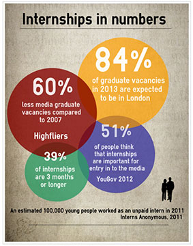
Feature teaser: The horrible truth about internships
Posted on March 26, 2013 by Alice Hancock
Ever wondered what kind of horrors the lowly intern has had to endure in their climb to the top? In this year’s XCity magazine, Alice Hancock investigates some of the worst intern atrocities from making the tea to stolen bylines and 14-hour working days.
We’ve compiled the numbers and the facts behind the internships to prove just how important they are, and what the fundamental difference is between an internship and work experience.
Make sure you know the difference between an intern and a “workie”
Internships should be…
- planned experience in a business for over a month
- overseen by someone in the company
- hands on – not just observing
- have set hours and specific tasks
Work experience should be…
- a placement of four weeks or less
- involve a mix of shadowing, observing and small tasks
- have flexible hours
- not replace the role of a staff member

City University: Then & Now
Posted on March 26, 2013 by Alice Hancock
As City’s Journalism department rolls on through its fourth decade, some of the earliest intakes of (then) aspiring, (now) established journalists tell tales of the course in its infancy.
Part of the founding cohort?
The course started as a diploma under the guidance of Tom Welsh, the first Course Director, in October 1976. It was a select group who made the cut. Thirteen out of 120 applicants.
Welsh recruited some experience journalists to teach this first cohort. He managed to persuade Harry Butler, at that time regional news editor of Press Association, to come and teach shorthand – a skill for which he was renowned throughout the industry. Alongside him were respected journalists Frank Edmead, the Guardian’s leader writer for 17 years who had resigned over differences on the editorial line taken on Vietnam, Tom Baistow, later deputy editor of the New Statesman, and John Dodge who became City’s first journalism professor – a role later filled by the likes of Roy Greenslade, George Brock and Heather Brooke.
Although it was a struggle to get the course accepted by the industry to begin with – and to get a vocational qualification accepted into the university’s roster of degrees – the students were enthusiastic (despite being told by the esteemed Sunday Times editor, Harold Evans, that they were a bit old to be starting in journalism). Their memories of the course, collected here, show a Fleet Street training at its best, dodgy 70s suits notwithstanding.
Current students on the course were amused – and amazed – at some of their predecessors antics. And a little surprised at the similarities. “Patch existed even then?” was a frequent refrain. It may have changed a little over the years, but all who have passed through the City Journalism department’s doors know what it’s like to be sent out onto the streets of London armed only with a notebook and a pen.
Such was the reaction from today’s bunch, that we decided to include a few of their tales alongside those of their City ancestors.
Writing Fast
THEN:
Two characters stand out for me and both were straight out of old Fleet Street. Harry Butler, a news editor from the Press Association, was an expert in Teeline shorthand and had written workbooks since the system was first launched for journalists in the 1960s. His passion for such a ‘dull’ subject was curious, as my friend Jacky Law observed. But Harry was an excellent teacher and turned dictation into a drama; he was a stickler for timing (naturally) and loved a story so we learned more than shorthand from Harry. And, of course, I still use his beloved Teeline. (Sarah Bayliss)
“I have an abiding memory of Harry Butler starting every dictation with the immortal phrase: “Mister Chairman, Ladies and Gentlemen”, with absolutely perfect enunciation.” (Sue Landau)
NOW:
“I arrived late to our first shorthand lesson. Ironically, Richard, our unbelievably passionate tutor, was, at that moment, lecturing his new recruits on the need to “break the habit of a lifetime” and arrive to class on time. “There will be times,” said Richard, “when a friend calls inviting you to the pub”. “Your response will be that yes, you will come, but in half an hour, once you’ve done your shorthand practice.” (Ellie Austin)
“Shorthand was, at times, a real drag. All those early mornings when you could have been preparing for patch Thursdays, or better still, asleep. But it was suddenly all worth it when Richard Ward delved into his power ballads collection – which I have no doubt is extensive – to give us a Whitney Houston classic. Watching him keep up with “I will always love you” and pausing with such practised precision just before the chorus always made my day.” (Teresa Fitzherbert)
At the bar: Learning to report in court
THEN:
“We were taught court reporting by a journalist we can only remember as Reg. He had dark, greasy hair and a dark, greasy jacket. He rubbed his hands together when describing a ‘good’ murder and always wanted to know if a woman in the dock was ‘blonde or brunette?’ He was like something out of a Dickens novel, and we used to have to go knocking for him at the gaoler’s office on our visits to the Old Bailey or Inner London Crown Court. That’s where Reg hung out. He made his living as a stringer for the News of the World and other tabloids and his fascination for crime – and punishment – was compelling. He was also politically incorrect when the term had hardly been invented but somehow, with us, he got away with it.” (Sarah Bayliss)
“My first experience of court reporting was straight out of a murder mystery. It was an Italian woman who had killed her husband after calling him a ‘spaghetti bender and papist bastard’ and hitting him over the head with a bottle.” (Nigel Dudley)
NOW:
“We had a hilarious case about a pretty brutal GBH. It centered on a rugby team night out, and the primary victim was being cross examined by the prosecuting counsel. He was asking him how many beers he’d had, and he was giving it, ‘Oh, not too many, I’m on a diet.’ Soon it came to the point in the story when they left the club. ‘What did you do then?’ asked the barrister. ‘Well’, said the huge rugby player, ‘we went to the kebab shop.’ The barrister then asked him, totally seriously, ‘What did you order?’ The guy replied, ‘A large Doner’ – pause – ‘with extra chicken.’ Then the barrister couldn’t resist saying, ‘Sounds like that diet’s going well then.’ Unbelievable.” (Matt Lambert)
Seeking stories
THEN:
“We went to Islington Borough Council for a bit of municipal reporting. The council was then 100 per cent Labour and, frankly, a bit boring. We left before the end – and missed a punch-up between a couple of councillors which was all over the Evening Standard the next day.” (Jon Slattery)
NOW:
“I’d still done no preparation for patch. So come Thursday afternoon I decided to wander around Cathedrals in the hope I’d find something interesting to write about. It was an hour before deadline and I had nothing. A few minutes before I’d seen a fat cat fight a chihuahua in the street, and was seriously thinking of writing about it – ‘catzilla terrorises the small dogs of Southwark’. Fortunately, some passing builders took pity on me and pointed me in the direction of the local pub where, after talking to the landlord, I found one of my best patch stories. Moral of the story – when in patch doubt, always go to the nearest pub.” (Sarah Holmes)
“Thursday patch was terrifying. Yet the relief of handing it in only lasted until Sunday night when you remembered you had to do the whole thing again. So imagine my utter joy when, on a casual Sunday morning glancing at Twitter, I saw someone at Farringdon Station (my patch) had posted a picture of no less than 100 people dressed as Power Rangers waiting for a train. Yes, the Mighty Morphing Power Rangers. Realising this was a picture story not to be missed I rushed down to Farringdon to get some snaps and public reaction. It turns out the Rangers were on their way to defeat a group of Zombies who were terrorising Waterloo. I couldn’t have made it up. Dave from Essex, dressed as a red Power Ranger, said it was “the best day of my life”. (Teresa Fitzherbert)
It wasn’t all easy…
THEN:
“From the start we knew we were pioneers of sorts and that our course tutor Tom Welsh had battles to fight on our behalf. The university hierarchy did not welcome a room full of typewriters nor the teaching of shorthand. This was not a polytechnic! Perhaps because we already had academic degrees, the changes did happen and we never felt unwelcome – just a bit different. And being slightly apart is not a bad way for trainee journalists to be…” (Sarah Bayliss)
“As part of the 1976-77 course requirement, the thirteen guinea pigs were required to attend a series of lectures entitled ‘Information Sciences’ dealing with the collation and dissemination of information – effectively, how to be a librarian.Since we had just nine months to learn the nuts and bolts of journalism, we considered to be somewhat surplus to our educational requirements and, led by the course representatives – myself and Terry Dignan (now editor of the BBC Radio 4’s ‘The Week in Politics’) – the group rebelled. A highly apologetic Tom Welsh explained with infinite patience that whilst he privately agreed with us, it was a requirement of the University for the journalism course to include some degree of academic content and that the ‘Information Sciences’ was it.
So as not to bring the wrath of the University elders down on our course tutor, we agreed to go along with the requirement but I can’t recall anyone going to more than two Information Sciences lectures. Nor can I recall having to sit an exam on the subject – yet we still all got our diplomas.”(Mark Newham)
NOW:
“One Thursday at 4:04pm I had done my sweeping stride up and down Fleet Street looking for signs and notices about buildings being knocked down, construction plans and so on.
In a desperate bid for some quiet solace and words of calm wisdom I entered the Christian Bookstore on the edge of my patch where Bibles and religious novels are stacked everywhere. I am not a desperately religious person but I thought a few silent prayers to the ‘other’ would increase my chances of a winning patch week. I did that and also bought a pocket book of ‘God’s little book of comfort’ which has phrases like: “Tought times do not last. Tough people do!: 2 Timothy 2:3″. It was 4:30pm at this point. I had no story. I left the bookstore and I waddled towards the Chancery Lane tube stop to make the dreaded ride home that would almost certainly roll over past 5:00pm…and the deadline.
In a moment of awe, light and angels, I found squatters being evicted in front of me. Like the judicious journo that I crave to be, I whipped out my iPhone and tapped furiously to the voice recorder app. Then in a 30 minute mad dash (laptop in tow) I legged it to the nearby Pret and banged out my 300 words. I had myself a genuine, stumbled across and impromptu story. In a moment of bleakness, my prayers had been answered.” (Georgie Bradley)
2013 XCity AWARDS

Cycle safety campaigner wins the 2013 XCity Award
Former City graduate Kaya Burgess has won the 2013 XCity Award for his pioneering campaign to improve cycling safety on Britain’s roads. Burgess, 27, (Newspaper, 2009) launched the ‘Cities Fit
XCity Award Shortlist: Anna Cavell
An interview with Anna Cavell “I’ve been threatened with arrest in the past and I’ve had my equipment taken from me by security forces.” Anna Cavell has faced a number
XCity Award Shortlist: Jessica Omari
Posted on March 15, 2013 by Hanna Ibraheem
An interview with Jessica Omari “I saw people living in a really, really bad state – in absolute poverty. There was no money, no water, and they said ‘this is

XCity Award Shortlist: Tom Lamont
Posted on March 14, 2013 by Chloe Cann
An interview with Tom Lamont “Remembering not to ask mood-killing nine-part questions is a persistent challenge.” Despite enjoying success as a feature writer and commissioning editor at The Observer, City

XCity Award Shortlist: Kaya Burgess
Posted on March 13, 2013 by Isobel Finbow
An interview with Kaya Burgess In November 2011, Kaya Burgess’s friend and colleague Mary Bowers was knocked off her bicycle on the way to work. Burgess arrived soon after the

XCity Award Shortlist: Fay Schlesinger
Posted on March 12, 2013 by Sophie Hurcom
An interview with Fay Schlesinger When David Cameron called comedian Jimmy Carr’s use of the tax avoidance scheme K2 “morally wrong” last summer, the journalists who broke the story never

XCity Award Shortlist: Emma Slater
Posted on March 11, 2013 by Matthew Lambert
An interview with Emma Slater “You have to be careful of personal safety,” said Emma Slater, “because some of the people that you deal with are in prison, having been

Longlist for third annual XCity Award announced
Posted on March 7, 2013 by Chloe Cann
The longlist for the third annual XCity Award has been announced today. Thirty nine former City students have been nominated by staff and alumni in recognition of their outstanding contributions

XCity Award Shortlist: Emma Slater
Posted on March 11, 2013 by Matthew Lambert
An interview with Emma Slater
“You have to be careful of personal safety,” said Emma Slater, “because some of the people that you deal with are in prison, having been convicted of serious crimes.”
Slater’s impressive investigation into supergrasses was one of a series of projects that led to her nomination for the 2013 XCity Award.
The report started life as the final project for her Investigative Journalism MA at City. “I did some voluntary work with the London Innocence Project,” said Slater, “and the key case that I was working on was that of Michael Stone. The case involved an alleged cell confession, which was questioned by his appeal team. I worked on the area for my masters project, and what I wrote was sent off to the review commission.”
Michael Stone was convicted of the murder of Lin and Megan Russell, and the attempted murder of Josie Russell, in 1996. He has continued to assert his innocence.
“With the supergrass investigations you have to be very careful because the information you reveal could potentially put people in danger. You also have to be careful not to give away any personal details.”

XCity Award nominee Emma Slater at the British Journalism Awards
Slater joined the Bureau of Investigative Journalism after leaving City, where she continued her work on supergrasses. Eventually, her project formed the basis for a BBC Panorama special entitled Return of the Supergrass.
“I think the programme was very good. My producer, Stephen Scott, was absolutely fantastic; I learnt so much from him. It’s an important story, and I’m glad it went out. I was also able to write a two page spread for The Independent, which covered different ground.”
Her other major investigations for the Bureau concerned drone strikes. The first revealed that Iranian television station Press TV had been fabricating reports of drone strikes in Somalia. The second was about covert US counter-terrorism activities in Yemen. These investigations were published in The Independent and The Telegraph respectively. “It was difficult trying to gather information on the ground from a desk in London. It’s important to verify every piece of information for yourself, because anyone you are talking to might have their own agenda.”
Slater is currently working for October Films, and a programme she has been working on will air tonight on Channel 4’s Dispatches. The programme is called Undercover Designer Dogs, and discusses the relaxation of quarantine rules and the potential for imported puppies to carry rabies or tapeworms.
Slater said that she was “thrilled” and “surprised” to be nominated for the 2013 XCity Award. She added: “I was looking at the list and there are so many amazing journalists who have done some incredible stories.”
The XCity Award recognizes outstanding contribution within the field of journalism, and Slater is the first of six shortlisted candidates to be named this year from the long list of 39.
The judging panel includes Professor Brock, head of City’s Journalism Department; XCity publisher Jason Bennetto; XCity editor Ellie Austin; Spencer Ball, head of marketing, and Sue Rees, head of alumni relations.
![]()
2011
XCity Magazine Digital Edition
– APRIL 12, 2011
Welcome to the 25th anniversary issue of XCity magazine, the flagship publication for City University journalism school
-

MARCH 30, 2011
Critics under threat
James Inverne, editor of Gramophone magazine talks to Elizabeth Davis about how criticism is changing and why his magazine is going to survive the storm.
I think the rise in celebrity critics is a total disaster. I’m very idealistic about the role of critics, and the choice of critics is absolutely key. When I was a kid – admittedly a geeky kid – I had a quote by the great tenor John Vicars stuck on my pin board: “all art is an elaboration of life and it represents the very greatest that humanity can achieve.”
So if that’s true then you have to pursue excellence in art – it can be a pantomime but whatever the hell it is, it’s got to be the best you can do it. And critics are there as Guardians of the Flame – they’re there to make sure that the forces of commercialism don’t drag standards down, to make sure that we keep pursing those goals because it’s the best of ourselves. When you look at critics who’ve been drafted in just because they’re big names it rarely works, because criticism is a really difficult craft.
I’ve always thought that great criticism makes you feel like you were there. It gives you something of the experience. It’s not just a school report saying this is good and this is bad. The reader should have a sense that they’ve vicariously listened to the recordings, through reading the reviews.
Social networking has an impact on the arts in general but across the media it’s the same people calling the tune. While everyone’s going on about the power of the citizen journalists – and undoubtedly they’re incredibly powerful – I don’t think we’ve really seen it in criticism. It’s a good way of getting enthusiasm and generalised feelings about things but I still think that the tradition of the professional critic is an important one. What you get in Gramophone is a kind of running relationship with the critics and even a sort of dialogue.
I think “magazine” has become a more generic term for a kind of experience you can have in different formats. We see ourselves as a – dreadfully dull term – content provider. It’s there if people want to see it on the web and it’s there if they want to see it on their phones. I tend to feel that there always will be people who love to feel the paper who love to smell the print and love to have control over the journey through a magazine. You get other excitements from the web so I don’t think magazines are going to disappear.
James Inverne, editor of Gramophonemagazine talks to Elizabeth Davis.
-

MARCH 25, 2011
The most important moments for journalism in the past 25 years
An interactive timeline
The last quarter of a century has seen a dramatic shift in the craft and practice of journalism, from the way we find and deliver news stories to the advancement in technology and birth of online platforms.
With nominations from Sir Harry Evans, Roy Greenslade, Ben Preston and other XCity contributors we compile a chronology of key media events in the past 25 years.
Written and compiled by Harriet Thurley
-

MARCH 24, 2011
BBC World Service Update
The latest update in our series following the BBC World Service cuts
By Sophie Monks Kaufman
The abolition of radio broadcasts from the Latin American service came “sooner than was expected”, according to an ex-employee of the BBC World Service.
Diana Zileri, who left the World Service in 2008, produced programmes on the expansion of the European Union and the 10th anniversary of the Rwandan genocide during her nine years working for the service known as BBC Mundo.
She said: “For me, working at the BBC was a good experience, I met interesting people and I learned a lot. I enjoyed it most when we worked with the radio. I was always surprised and amazed when people in Latin America told me that they had heard me on the radio while they were in the middle of the traffic in México City, driving along the Panamerican Highway in Peru or while they were crossing the desert in Chile.”
Ms Zileri, who graduated from City’s International Journalism course in 1996, added: “It is very sad to know there would not be any more transmissions. I was not surprised but it came sooner than was expected.”
BBC Mundo had its last radio broadcast on Friday 25 February. It continues to exist online.
-

MARCH 23, 2011
Having a Ball with James
Sophie Monks Kaufman goes to King’s Place to meet the Guardian’s James Ball
By Sophie Monks Kaufman
I’m at the Guardian headquarters in King’s Cross waiting to interview data journalist and former WikiLeaks employee, James Ball. Once he appears, I’ll have half an hour to interview him. This is to take place across a range of platforms as part of XCity’s mission to provide a solid multimedia presence. For me this is a brave new world. I am armed with a mass of equipment: a Dictaphone, a digital camera, a flip camera and tripod.
Earlier, I took the precaution of spending 20 minutes with Dave, the technician who hangs out in a room beside the City journalism department. We had a trial run in which I practised erecting the tripod and attaching the camera to it. Dave gave me advice like:
1. Stand to the side of the camera and ask James to look at me.
2. Make sure there is something interesting in his background.Despite the tutorial, my mind is plagued by images of knocking James out with a careless swing of the tripod.
But lady luck looked after me…
James answered all questions with gusto and goodwill; I got a background courtesy of the canal behind the Guardian canteen (the film of scum and Tesco bags were invisible from our lofty position) and, most importantly, the tripod kept a respectful distance from the XCity Award nominee. A good day at the office in my view, but you can judge for yourself as James Ball talks about his interview blunder with a big shot from The Times, the significance of WikiLeaks and the likelihood of a national newspaper going under.
-

MARCH 7, 2011
George Brock: 10 predictions for journalism during the next 25 years
George Brock tells us how he sees the industry in the future
In 25 years’ time:
1. The gap between the gloom and doom endlessly debated by journalists and the happiness felt by the consumers of news will widen – at least in the short term. Consumers of news currently enjoy the proliferation of sources of news more than they worry about the accuracy or integrity of its source.
2. A credibility crisis will sooner or later remind people that not all sources of news are equally trustworthy. Most probably, an authoritarian or totalitarian will, by smart manipulation of a fashionable new digital platform, fool a lot of people. Well-known faces will be red.
3. A combination of the behaviour of red-top newspapers and worries about social networks will combine to increase pressure for new legislation on privacy. The politico-legal negotiations will be long and bad-tempered. But in the end we will have a new privacy law in Britain.
4. Journalism done in words will struggle to survive, given that audio and video are now so easy to create and consume on digital platforms. But words – capable of containing more complex ideas and meaning than broadcast – will survive and prosper.
5. Some newspapers will go bust. This is more likely to happen to daily papers than to weekend ones, let alone to magazines (which will go on flourishing) and fatalities are more likely to occur outside the M25. Predictions of doom for print may sometimes have been both premature and overdone, but the advertising model for daily papers has been fatally weakened by the fact that younger readers rarely acquire a regular paper-buying habit.
6. The next 25 years will be a period of extraordinary innovation and creativity in platforms, techniques and the wholesale rethinking of journalism. Data journalism and the creation of online communities are only just the start.
7. The 2010 drama of Wikileaks will be followed by governments all over the world shutting the stable door to prevent other horses leaving. The source for the biggest Wikileaks disclosures will go to prison for a long time. Leaks on the scale of two sets of warlogs and the US diplomatic cables may not occur again any time soon.
8. Transparency will improve journalism. Software is now available to spot plagiarism and, by extension, churnalism. Naming and shaming will occur and will gradually have an effect.
9. Journalism will remain glamorous and important to a minority and, to a much larger segment of the population, suspect, morally dubious and either controversial or disappointing.
10. People will regularly ask whether in a world in which anyone can publish instantly to anyone, anything called “journalism” is needed. They will discover that trying to discover and describe the truth is best done by people trained to do it well.
Professor George Brock is head of journalism at City University, a post he took up in 2009. Previous to this, Brock worked for The Times as a writer and editor for 28 years. He chairs the British committee of the British Press Institute and is a board member of the World Editors Forum. Brock also writes a regular blog,
-

MARCH 9, 2011
Then & Now: UK Riots
The first in our series exploring how reporting major events has changed over time
The Eagle landed in the Sea of Tranquility at 20.17 (GMT), 20 July 1969. Just a few hours later, Neil Armstrong climbed down the ladder of the lunar module and became the first human being to set foot on the surface of the moon. Thanks to a camera on the side of the module, he was watched live by an estimated global television audience of 600 million people.
That we were able to fly men to the moon – and bring them home again safely – was in itself a remarkable achievement. But that a sixth of the world’s population at the time was able to tune in, and hear Armstrong’s famous words upon taking his first steps on the lunar surface, was truly a giant leap for broadcasting.

The fact that the technology existed to beam these events across the world was a key reason for their taking place at all – in the height of the Cold War, President John F Kennedy needed something that would capture the public imagination. And today, thanks to the advent of sites like Twitter and YouTube, people are able to feel more connected than ever before to the working life of astronauts aboard the International Space Station (ISS).
The Apollo 11 moon landing was a significant moment not just in science, but also in television history; some 125 million people across America alone witnessed the moonwalk. Around 94 per cent of television households in the States watched an average of 15 and-a-half hours of coverage over the two week period surrounding the mission.
In Britain, people were hooked on coverage of the expedition, and this was reflected in the TV schedules. All three existing channels, BBC1, BBC2 and ITV, were packed with Apollo-related programming.

We take 24-hour rolling news for granted now, but the moonwalk, which took place at 3.56 am UK time, paved the way for this development. For the first time in British television history, there were all-night broadcasts, with both BBC1 and ITV staying on air throughout the night to cover the moonwalk.
In a diary entry for July 21st 1969, comedian Michael Palin summed up what has now become familiar for anyone who has watched rolling news: “The extraordinary thing about the evening was that, until 3.56 am, when Armstrong clambered out of the spaceship, and activated the keyhole camera, we had seen no space pictures at all, and yet ITV had some how contrived to fill ten hours with a programme devoted to the landing.”
TV has moved on in the 32 years since the Apollo 11 mission. Science fiction too has continued to become fact, with a permanently inhabited space station now in orbit around the Earth. And recognising the public’s continued fascination with all things astronautical, NASA and other space agencies now supply the world – and its media – with greater access than ever before.
Last year Soichi Noguchi, a Japanese aeronautical engineer living aboard the ISS, became a Twitter sensation when he became the first person to tweet photographs of the Earth from space. Noguchi’s incredible pictures were picked up by newspapers and magazines around the world [The Times, Daily Mail, The Daily Telegraph].
One of Astro Soichi’s photos:

NASA now even has its own TV channel where it broadcasts live footage of missions and events, as well as its YouTube channel which it uses for video blogs from crew members aboard the ISS. These videos provide an amazing insight into the daily lives of the astronauts aboard the space station, as well as stunning photography of the Earth. You can even watch potty training, NASA-style.
In total, videos on NASA’s main YouTube channel have had almost 19 million views. This is a huge number of hits, but it doesn’t even come close to the 288 million of viral videos such as “Charlie bit my finger”. Soichi Noguchi amassed over 330,000 followers on Twitter – 30,000 more than JLS and almost twice as many as Jedward – but sadly that’s still 1.5 million short of Charlie Sheen.
It is hard today to imagine an outer-space event that could trump the 1969 moon landing’s mass media coverage and record-breaking audience figures. But there is a vast amount of coverage of extra-terrestrial exploration out there, and almost all of it online. Since the Apollo 11 mission in the summer of 1969, innovations in communications have been keeping pace with those in space travel – the final frontier has never been closer to home.
-

MARCH 8, 2011
Getting cosy with Kelvin MacKenzie
Harriet Thurley recounts her interview with the former editor of The Sun
I arrive at my interview with Kelvin MacKenzie at Charlotte Street Hotel near Soho. It’s 11.15am. I’m 45 minutes early. I have spare batteries stuffed into every pocket, more than enough to power the dictaphone, camera and Flipcam I’m carrying for at least a year. It’s best to be prepared.
I’ve spent days researching MacKenzie, watching him in YouTube clips and reading his column in The Sun to try and discover why he has been described as the “lowest of the low”, a “dangerous genius”, “The Great Man” and everything in between.
I check my dictaphone works one last time.
At exactly 12pm, he appears. He walks towards me and the entrance of the hotel cafe talking on his Blackberry. After hanging up his phone, he shakes my hand and says: “Cold hands, warm heart.” I regret my response immediately: “That’s what my granddad says”.
He strides into the cafe and chooses a round table big enough for eight people. We order coffees. “So, how are we going to do this?” he asks.
We talk for an hour. I encourage his hilarious anecdotes and metaphors. Occasionally he edges towards the voice recorder when he knows he has a great one-liner to deliver. When he is satisfied with his comment he sits back in his chair with a huge grin.
I stop my dictaphone halfway through and listen back to ensure it is picking up our conversation. Thankfully, it is.
MacKenzie curses often and talks loudly, causing a few heads to turn when he bellows words such as “shagging” and dildos”. It is only a Thursday afternoon and we are in a nice part of town. He laughs off the attention.
Before I get to Tottenham Court Road tube station I check my dictaphone. Just in case. I play back a snippet of our conversation then put it away. Before I go down the steps to the station, something makes me want to check it again. Just in case. I look at the screen. I can’t find the dictation. It reads: ‘66 minutes remaining’. My heart sinks. It’s gone. “No,” I whimper. “Please no.” I mash some buttons. It’s really gone.
I panic. What will my tutor say? What will my friends think? Can I go back to the cafe and ask him to do it all over again? I start to run back, still mashing the buttons. Then suddenly the recording appears. Thank goodness.
Note to self: first pay packet goes on a new dictaphone.
My conclusion: Kelvin MacKenzie is indeed a dangerous genius but a rather pleasant and hilarious one. Read the full article in the 25th edition of XCity – out April 2011.
-

MARCH 9, 2011
Xcity student Jojo Moyes picks up award for fiction
Author wins Pure Passion prize
By Nikki Osman
Ex-City student Jojo Moyes has won the Romantic Novel of the Year award at the Romantic Novelists Association’s Pure Passion Awards, which took place on Monday 7 March in Whitehall.
Moyes, who graduated from City’s MA Newspaper course in 1993, collected the prize for her story ‘The Last Letter from Your Lover’.
Moyes said: “It’s very gratifying to win this award. Writing a book is such an act of faith – to have affirmation that people have really ‘got’ it, and liked it, is all a writer can ask for.”
Moyes has published seven books since becoming a novelist after leaving The Independent where she worked as assistant news editor. She is currently working on her next project, a story set in occupied France in 1916.
“It’s a period of history I knew nothing about and I’m finding the research fascinating.”
Moyes tells XCity how to turn yourself from a journalist to a novelist, in the print edition available from April 2011.

MARCH 13, 2011
Top 5: journalists on screen in the 21st Century
We run down the five best screen portrayals of journalism the decade has to offer.
-

MARCH 14, 2011
Then & Now: Royal Weddings
The second in our series exploring how reporting of major events has changed.
As we brace ourselves for the wedding of the year the media is brimming with speculation on the dress, the venue and the coveted guest list. But even though the topics remain the same compared to 30 years ago, how we discuss them has changed. Helen Stuart reports.
29 July 1981, St. Paul’s Cathedral, London. The stage was set for the definitive fairytale wedding: the union between the future British monarch and a 21-year-old ingénue, a princess in the making. The 3,500 guests who watched the couple exchange vows in the grand surroundings of the cathedral were dwarfed by the estimated 750 million television viewers worldwide who bore witness to the spectacle

The ceremony was the peak of media saturation of the Royal couple. Their engagement was announced on 24 February 1981 and they gave an immediate interview with the BBC, during which Prince Charles muttered that immortal line that came back to haunt him in the 1990s when their marriage ended.
“Whatever ‘in love’ means.”
From that moment on, the media had a wealth of stories. Any new development in the wedding plans was worth a few hundred words of copy, at least (The Times’ archive of Royal wedding related stories is here).
Magazines also got in on the act, with plenty of special editions and commemorative covers to celebrate the impending marriage. The Radio Timeseven ran a competition to design the cover. So successful was it that they are repeating the competition this year.
16 November 2010 and we are living in a very different world. Multi-channel TV, falling sales in newspapers and, of course, the internet, have changed the face of media forever. Clarence House took the unprecedented step of announcing the engagement of HRH Prince William to Miss Catherine Middleton to the public via Facebook and, sparking rolling news coverage using stock video footage of the couple and speculative chatter online:
Photographers and journalists were duly called to St. James’ Palace for a
And an extended interview with the pair and ITN’s Tom Bradby was televised later that day:
An onslaught of media coverage ensued and continues to this very day. A variety of outlets house specific Royal Wedding sections on their websites (Daily Mail, The Daily Telegraph, Vogue, and Hello are just a few examples) and magazines have gone to town with the upcoming nuptials.
Excepting the bizarre Warhol-tribute to Kate in February’s Tatler (click here), it’s the lower-rent gossip mags that have struck gold with the engagement, especially in the States. Covers of People, OK! U.S.A and US Weekly have been dominated by the British bride and groom, demonstrating the international appeal of a Royal wedding.
As news of the guest list spreads and the invitations are sent out (and perhaps for the first time, thanks to the wonders of the internet and Flickr, seen by non-invitees too), the globe-encompassing nature of the event has become clear as it was revealed a Mexican teenager was on hunger strike outside the British Embassy in a bid to win an invite to the ceremony.
On 29 April, the commoner will become a princess and millions will be watching – only this time, the viewing public will also be tweeting, live-blogging and posting photos of their Royal Wedding street parties and celebrations on Facebook too. -

MARCH 23, 2011
City Students win American Scholarship
Postgraduates from City to work on Berkeley’s News 21 scheme
-

MARCH 23, 2011
25 Years of XCity
We look back at the 25 covers and our favourite features from XCity
The Twit Awards
MARCH 8, 2011
By Miranda Thompson
VOTING HAS NOW CLOSED
You’ve had the Oscars, the Brits, and the Grammys – but the best is yet to come. XCity Online is proud to present the inaugural Twit Awards: a ceremony dedicated to those journalists who dominate Twitter timelines during every waking moment.
Our hard-working Twitter addicts have pored over every page refresh to find the Twitterati most deserving of an XCity accolade and shortlisted the most worthy below.
Check out the categories, the nominees and vote for your favourite. Winners will be announced in the forthcoming 25th anniversary issue of XCity Magazine, out 11 April.
VOTING HAS NOW CLOSED.

More Background On XCity-Magazine.com
XCity-Magazine.com functioned as the official online platform for XCity, an annual showcase magazine created by postgraduate students in the Magazine Journalism MA program at City, University of London. Emerging during a transformative period in media, the site captured the intersection of traditional print journalism and the rapidly expanding digital landscape. It served as both a portfolio for emerging journalists and a public-facing publication that demonstrated the standards, creativity, and ambition of one of the United Kingdom’s most respected journalism programs.
Although the site is no longer actively updated, archived versions—along with related materials from the broader XCity project—offer valuable insight into how journalism education adapted to technological change, shifting audience expectations, and evolving industry practices.
Origins and Purpose of XCity Magazine
XCity itself predates the website, originating as a print publication tied directly to the curriculum of City’s journalism school. The Magazine Journalism MA program, widely regarded as one of the UK’s premier training grounds for aspiring magazine writers and editors, developed XCity as a capstone project. Each year, a new cohort of students would conceptualize, research, write, design, and publish a professional-quality magazine.
The goals of XCity were multifaceted:
- To provide hands-on, real-world editorial experience
- To simulate the pressures and workflows of professional magazine production
- To connect students with industry professionals, alumni, and potential employers
- To produce journalism that could stand alongside established publications
XCity-Magazine.com extended these goals into the digital realm. It allowed students to experiment with multimedia storytelling, publish additional web-only content, and reach a broader, global audience beyond the physical distribution of the print magazine.
Ownership and Institutional Backing
The website and magazine were not commercial ventures in the traditional sense. Instead, they were institutionally supported by City, University of London, specifically through its Department of Journalism. This backing gave XCity a unique position: it operated with editorial independence typical of student publications, yet benefited from the credibility, resources, and academic rigor of a major university.
Faculty members, many of whom were experienced journalists from leading publications such as The Guardian, The Times, and the BBC, provided guidance and mentorship. However, the editorial direction, content decisions, and production responsibilities were largely student-led. This structure mirrored real-world newsroom hierarchies, with students taking on roles such as editor-in-chief, section editors, writers, designers, and digital producers.
Editorial Content and Features
One of the defining characteristics of XCity-Magazine.com was the breadth and depth of its editorial content. The site featured a mix of long-form journalism, interviews, investigative pieces, cultural commentary, and industry analysis.
Feature Journalism
Feature articles were at the heart of the publication. These pieces often tackled complex social, political, and cultural issues, demonstrating the analytical and storytelling skills of the students. Topics ranged from media ethics and the future of journalism to societal issues such as labor conditions, public policy, and cultural trends.
A notable example from the 2013 archive explored the realities of internships in the media industry. The piece examined exploitative practices, blurred lines between internships and unpaid labor, and the structural challenges facing young journalists trying to enter the profession.
Interviews and Profiles
The site regularly featured interviews with prominent figures in journalism, media, and culture. These included editors, broadcasters, and industry insiders who provided insights into their careers, the state of the industry, and advice for aspiring journalists.
Such interviews not only enriched the content but also strengthened the publication’s credibility and connection to the professional world.
Industry Analysis and Commentary
XCity-Magazine.com also functioned as a platform for critical reflection on the media industry. Articles examined trends such as:
- The rise of digital journalism
- The impact of social media on reporting and criticism
- The evolving role of critics in a democratized media environment
- The challenges facing traditional print publications
These pieces often blended academic insight with practical reporting, reflecting the hybrid nature of the students’ training.
Multimedia and Experimental Content
As a digital platform, the website allowed for experimentation beyond the constraints of print. Students incorporated:
- Video interviews
- Interactive timelines
- Photo essays
- Social media integration
This multimedia approach aligned with broader industry shifts toward cross-platform storytelling and audience engagement.
The XCity Awards
A standout feature of the XCity ecosystem was the annual XCity Awards. These awards recognized outstanding achievements by alumni of the journalism program, many of whom had gone on to successful careers in major media organizations.
The awards served several purposes:
- Celebrating the accomplishments of former students
- Strengthening alumni networks
- Inspiring current students
- Enhancing the reputation of the program
Nominees and winners included investigative journalists, feature writers, and broadcasters who had made significant contributions to the field. Coverage of the awards on the website included interviews, profiles, and analyses of the nominees’ work.
Audience and Reach
While XCity was a student publication, its audience extended far beyond the university. The print magazine was distributed to thousands of alumni, including editors, publishers, and journalists working across the UK and internationally.
The website further expanded this reach, making content accessible to:
- Prospective journalism students
- Media professionals
- Academics and researchers
- General readers interested in high-quality journalism
This dual audience—both internal (students and alumni) and external (industry and public)—shaped the editorial tone. Content needed to be both educational and professionally credible.
Popularity and Industry Perception
Although not a mass-market publication, XCity held a respected position within journalism circles. Its reputation stemmed from:
- The prestige of City’s journalism program
- The quality and ambition of its content
- Its role as a training ground for future journalists
Many alumni who contributed to XCity went on to work for major outlets such as:
- BBC
- The Guardian
- The Telegraph
This track record reinforced the publication’s credibility and visibility within the industry.
Location and Cultural Context
XCity-Magazine.com was rooted in London, one of the world’s leading media capitals. The university’s location provided students with direct access to:
- Major news organizations
- Cultural institutions
- Political centers
- Diverse communities and stories
Proximity to areas such as Fleet Street—historically associated with British journalism—added symbolic significance to the students’ training and work. The city itself often served as both subject and backdrop for the publication’s stories.
Educational Value and Training Model
One of the most important aspects of XCity-Magazine.com was its role as an educational tool. The process of producing the magazine and maintaining the website required students to develop a wide range of skills, including:
- Research and reporting
- Writing and editing
- Fact-checking and verification
- Design and layout
- Digital publishing and content management
- Team collaboration and project management
The tight deadlines and high expectations mirrored professional newsroom environments, preparing students for the realities of the industry.
Adaptation to Digital Transformation
The early 2010s were a period of significant change in journalism. Traditional business models were under pressure, and digital platforms were reshaping how news was produced and consumed.
XCity-Magazine.com reflected this transition. It demonstrated how a legacy format—print magazine journalism—could be adapted to a digital-first environment. The site’s integration of multimedia content, social media, and interactive features showed an awareness of emerging trends and a willingness to experiment.
Challenges and Limitations
Despite its strengths, the website also faced challenges typical of student-run and institutionally supported projects:
- Limited lifespan for each editorial team, leading to shifts in direction and continuity
- Resource constraints compared to commercial publications
- Dependence on academic schedules and timelines
These factors contributed to the eventual archival status of the site, as newer cohorts adopted updated platforms and formats.
Legacy and Continued Influence
Although XCity-Magazine.com is no longer actively maintained in its original form, its legacy continues in several ways:
- The XCity magazine itself remains an ongoing project within the program
- Alumni continue to influence the media industry
- The site serves as an archive of early digital journalism experimentation
The project stands as an example of how academic institutions can contribute meaningfully to the evolution of media, not only by teaching theory but by producing real, impactful journalism.
Press, Media Coverage, and Recognition
While XCity did not typically receive mainstream media coverage in the way commercial publications do, it was well-regarded within academic and professional journalism communities. Faculty involvement, alumni success, and the quality of the work produced helped maintain its reputation.
The inclusion of interviews with high-profile journalists and coverage of industry events further positioned the publication as a credible voice within its niche.
Cultural and Social Significance
XCity-Magazine.com holds cultural significance as a reflection of a specific moment in journalism history. It captures:
- The transition from print to digital media
- The challenges facing young journalists entering the industry
- The role of education in shaping media practices
It also highlights the importance of mentorship, collaboration, and experimentation in developing the next generation of journalists.
Insights and Key Takeaways
Several key insights emerge from examining XCity-Magazine.com:
- Education and Industry Alignment The project successfully aligned academic training with real-world industry practices.
- Adaptability It demonstrated the importance of adapting to technological change and evolving audience expectations.
- Community Building By connecting students, alumni, and professionals, it fostered a strong journalism community.
- Experimentation The platform encouraged innovation in storytelling and content delivery.
XCity-Magazine.com represents more than just a student website—it is a case study in journalism education, digital transformation, and the enduring value of storytelling. Through its combination of rigorous training, creative freedom, and professional engagement, it provided a launchpad for countless aspiring journalists.
Even in its archived form, the site offers valuable lessons for educators, students, and media professionals. It stands as a testament to the idea that great journalism can emerge from anywhere—including the classrooms and collaborative spaces of a university committed to excellence.